Building a Design System

Senior Product Designer • DriveWealth • May 2021 - Dec 2021

This case study illustrates how I built a unified design system at DriveWealth. I was hired to set up all the foundational elements of a good design practice (i.e. design system, tools, processes, design culture). The first step was working towards a centralized design system that promotes consistency and efficiency across all products, design teams, and engineering.
Due to NDA, I have limited and obfuscated confidential information in this case study. All information in this case study is my own and does not necessarily reflect DriveWealth's views.

My Role
As the first Senior Product Designer, I spearheaded research initiatives and design responsibilities to develop a strategic rollout of the first design system at DriveWealth. I worked alongside the Product Manager to define project goals and roadmap to plan and execute the design. I collaborated with over 6 front-end developers on the implementation. The design system successfully launched in late 2021 across all of DriveWealth’s core platforms.

Who is DriveWealth?
DriveWealth is a global B2B fin-tech technology platform offering brokerage APIs to power investing and trading experiences. Their solutions power securities trading experiences from onboarding to account management, asset servicing to investing, and reporting to partner support. Their platforms–partner portal, client portal, order management system–all serve different functions of the trading management lifecycle.
The Challenge
When I first joined, there were disparate experiences across their different platforms. In addition, inconsistencies in design elements, legacy interface components, and scattered resources across teams and projects made the consolidation even more challenging to achieve consistency and efficiency. Creating and implementing a unified design system first will help alleviate the ambiguity of design.

Setting the Design Principles
Goals
Create a design system that
  1. Provides brand consistency and improved user experience
  2. Reduce technical debt and increase development speed
  3. Gain alignment and adoption across the organization
Metrics
Usage Consistency Time Saved

Satisfaction Adoption Rate
My Approach
“It [really does] depends.”

The perfect design process doesn’t exist–each project warrants different tools, methodologies, and processes. As a seasoned designer, I have to evaluate business goals to ensure a project’s success and figure out the best solution for a design problem.

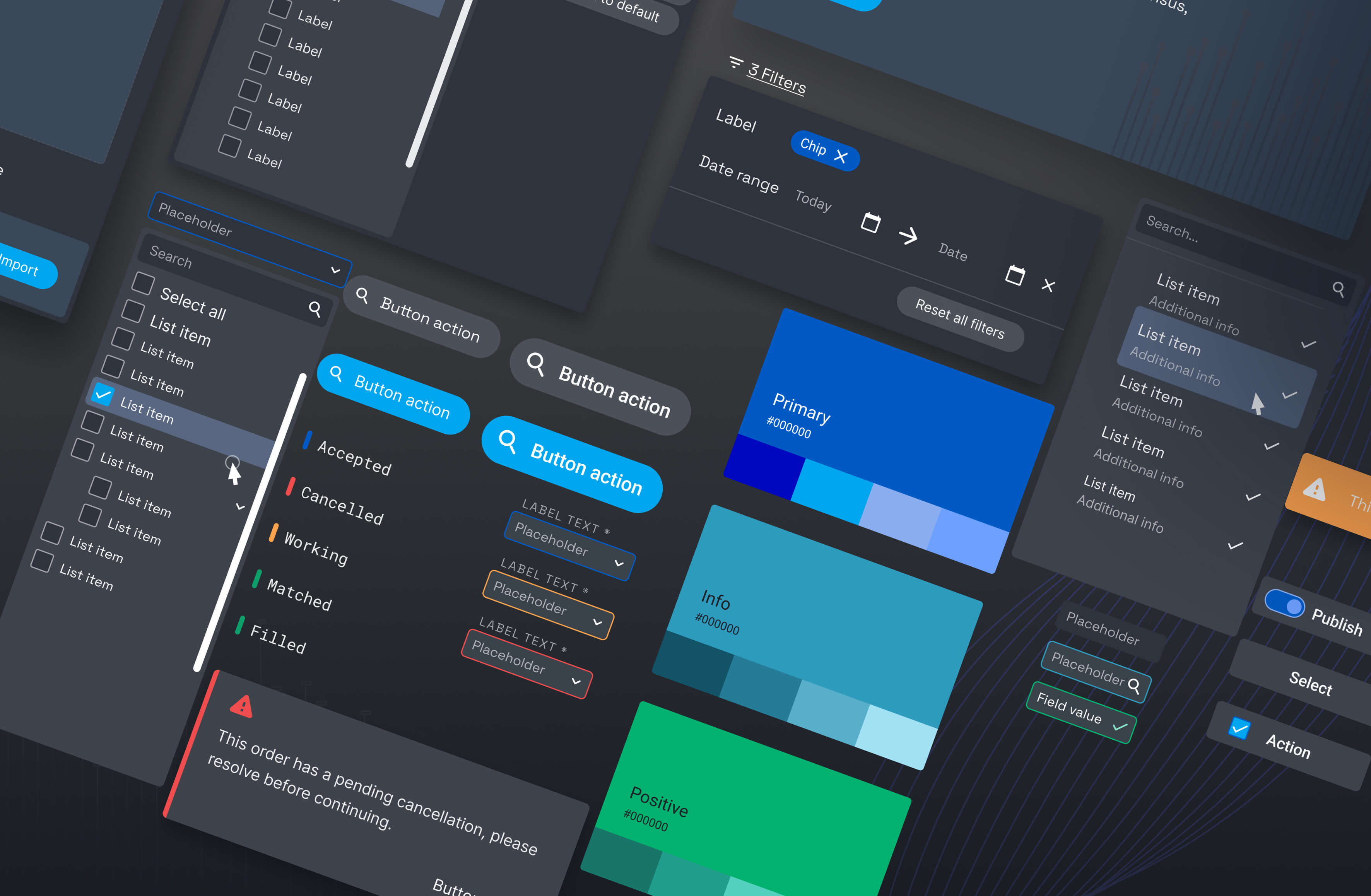
Tools: Figma, Storybook

Research Methods: A mix of User Interviews, Concept Testing, Usability Testing

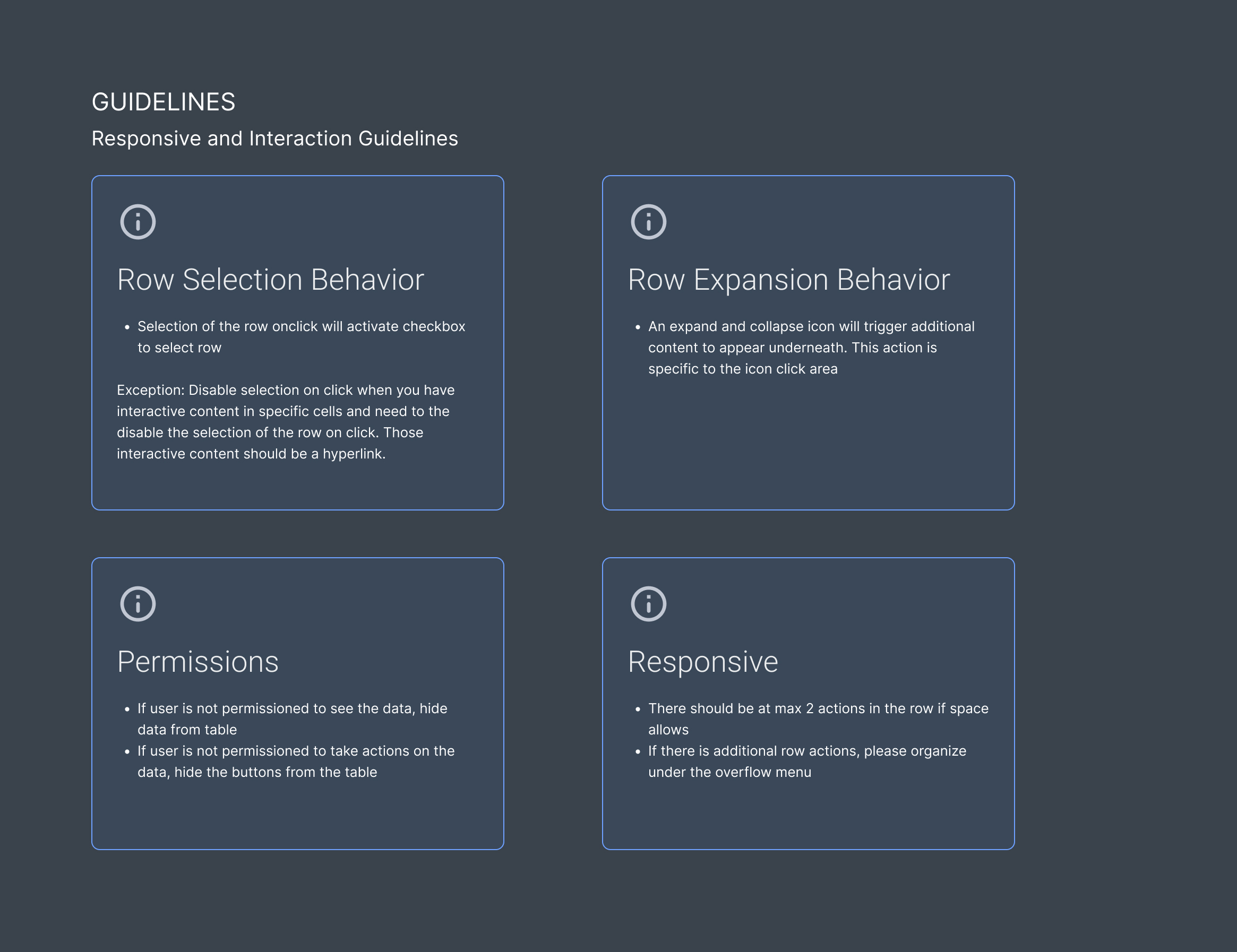
Research & Collaboration
  • Conduct user interviews with different stakeholders to understand challenges with the current or lack of design process
  • Conduct user interviews with platform users to understand how they use the apps, and what are their jobs-to-be-done (JTBDs) to help inform design
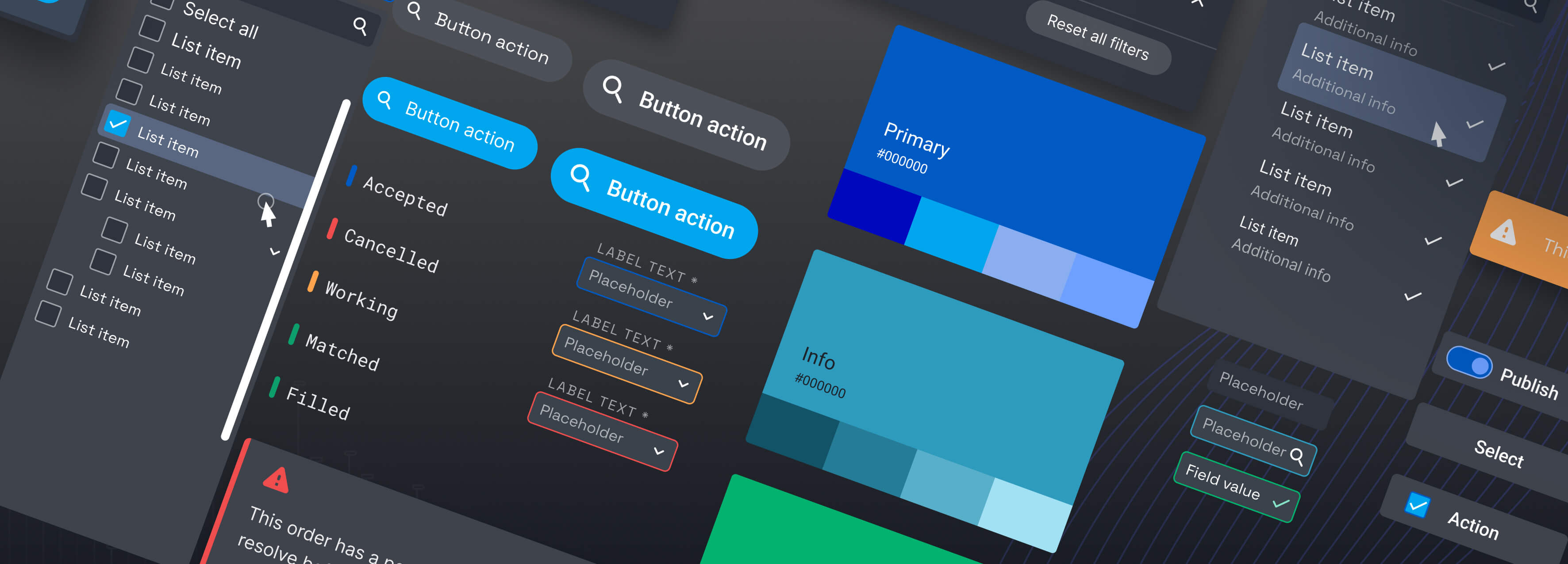
  • Collaboration with developers to create a shared and reusable component library to help developers and designers across the organization. A shared component library will help accelerate the development of multiple platform experiences with reusable and modular UI elements.
Results

Consistency Time Saved Adoption Rate
  • From a design front, the new component library helped us bring consistency in design, improved collaboration across the organization, and greatly saved time and effort on projects across different teams.
  • From the development front, the new component library led to a more streamlined, standardized development process, reduced the amount of code duplications, and improved collaboration across teams.
Perform Audits
First, I took stock of the current design elements across the different platforms. Then I consolidated the different usages and tried to understand the intention behind these choices. I faced several issues while designing and developing these components, including inconsistent padding, margins, button size, spaces between elements, typography choices, varying page layout structures, and even labeling and taxonomy.

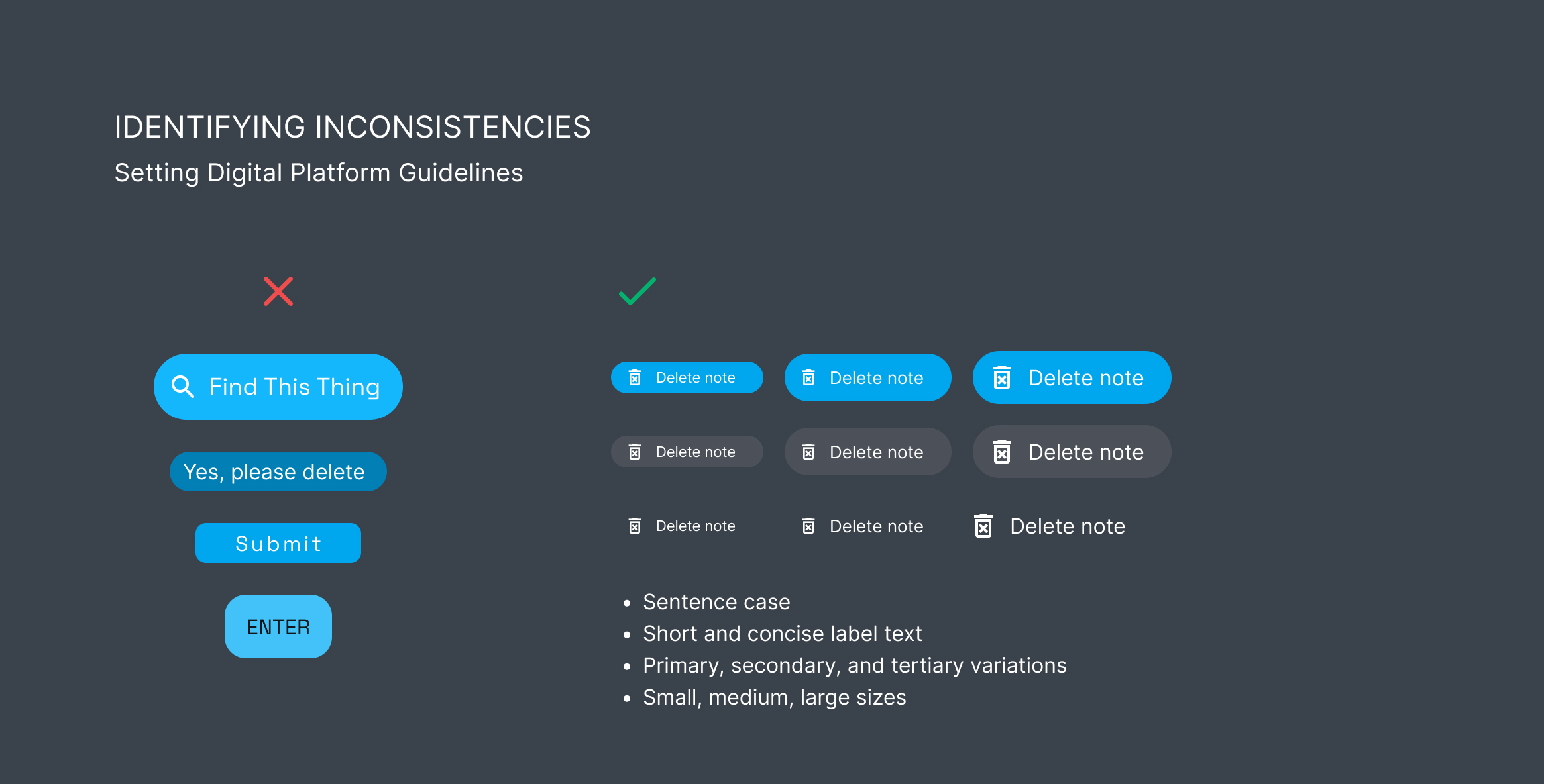
Identifying Inconsistencies in the Design System
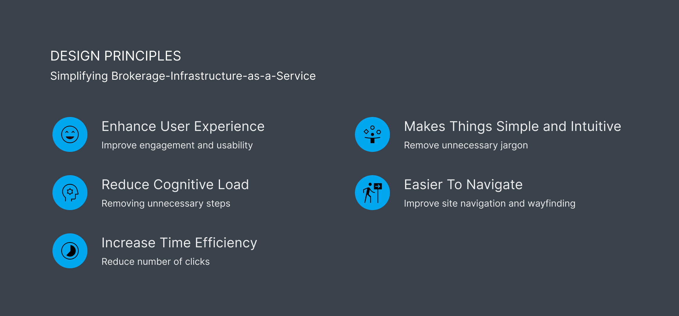
Define Standards
Brand guidelines + digital platform guidelines
How do we ensure a set of rules and standards that communicate how the brand should be represented? And how do we extend those brand guidelines across digital experiences?

Results

Consistency Satisfaction
  • As an extension of the brand’s guidelines, we defined how the brand is articulated through digital experiences. Examples include logo usage, consistent copywriting, and color usage across platforms.
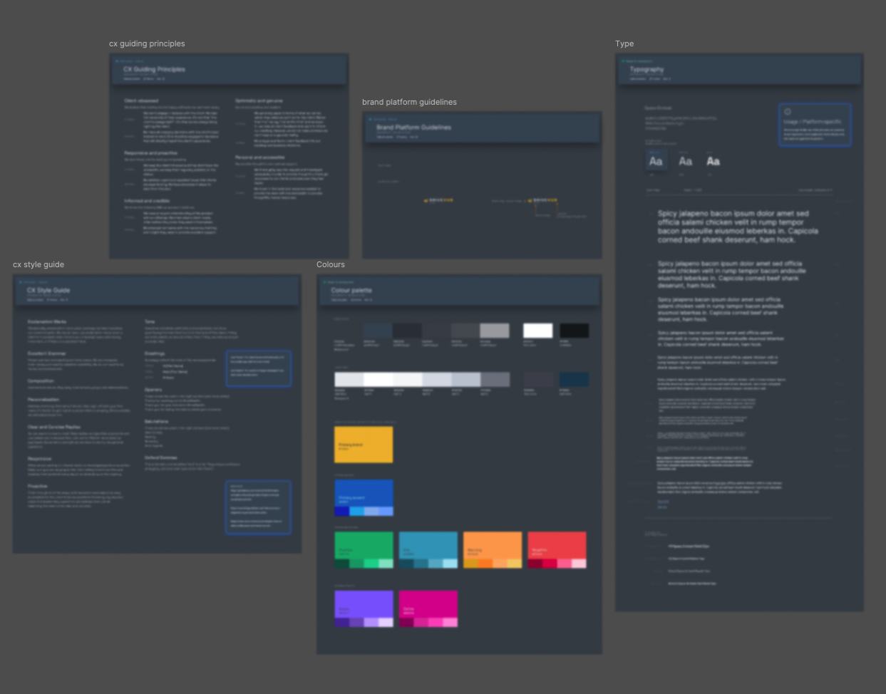
Setting the Brand Guidelines

WCAG accessibility standards
How do we ensure that the code we deploy is written per the WCAG accessibility standards to make our experiences more accessible to people with disabilities?
  • To ensure the design meets accessibility standards for a diverse user base, we had to cover basic accessibility: ensure sufficient color contrast, accessible navigation, use meaningful labels and tags, and aria-label for non-text objects, and more.
Prioritization
Part of the rollout strategy was to quickly stand up the design system so that teams could point to the new UI component library. I had to prioritize based on impact vs value. We started with the implementation of atoms and molecules components first, then I conducted a design QA in phases to help ensure consistency across the different platforms. I had to make trade-offs and deprioritize features such as light mode, widgets & data visualization, to focus on foundational work first.

Iterative Design
Designed with designers and developers in mind
  • Using the atomic design framework to easily compartmentalize design/dev components, starting with the smallest atom component to build upon each other to form complex designs.
  • This framework helped me rethink how to organize the design system to make our workflows more efficient. How I describe this framework to the team: is to think of the smallest components in your design system, these are called atoms. Just like real scientific atoms, there’s no way to break it down even further. Items like buttons, and icons standalone as is. You would then group atoms to form molecules; group molecules to form organisms and so forth. Then you have templates and page layouts to help design the structure once and reuse wherever it is applicable.
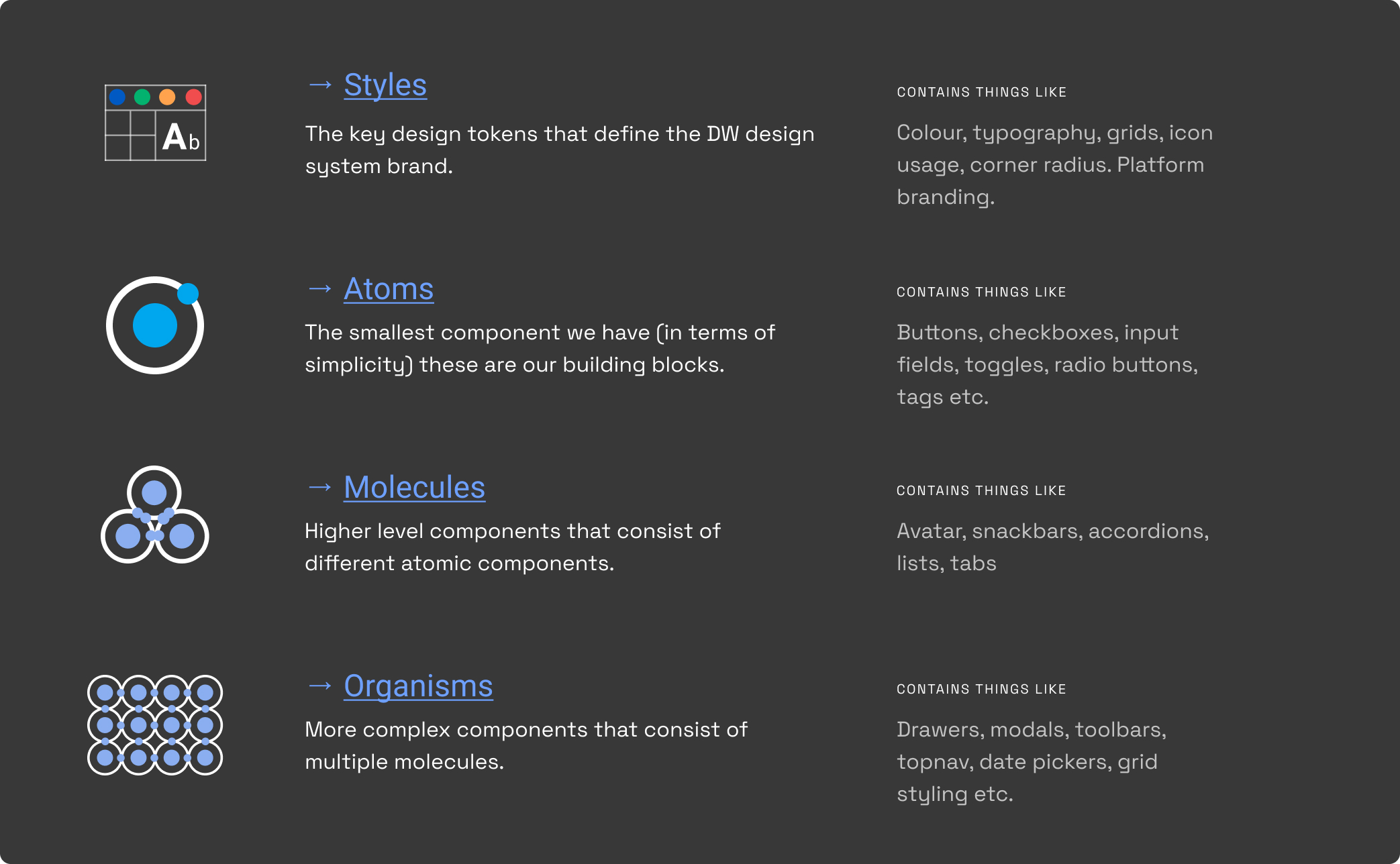
Using the Atomic Framework to organize the Design System

Results

Usage Consistency Time Saved

With predefined components, I could rapidly create mockups and prototypes, reserving more time and effort for feature exploration and ideation. This also made validating ideas more rapid, since I don’t have to focus on designing each UI element again.

Choosing Material UI (MUI)
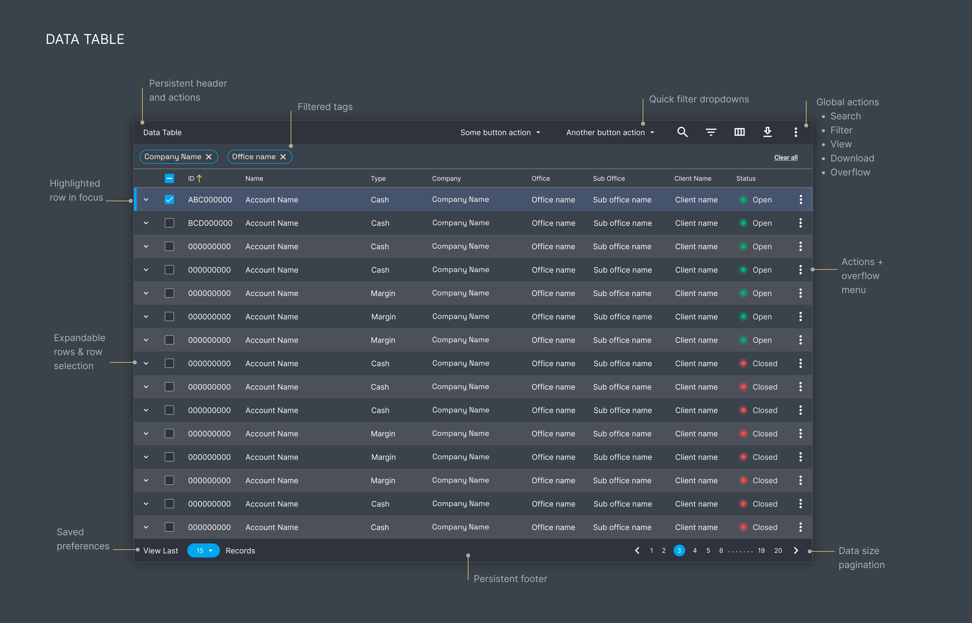
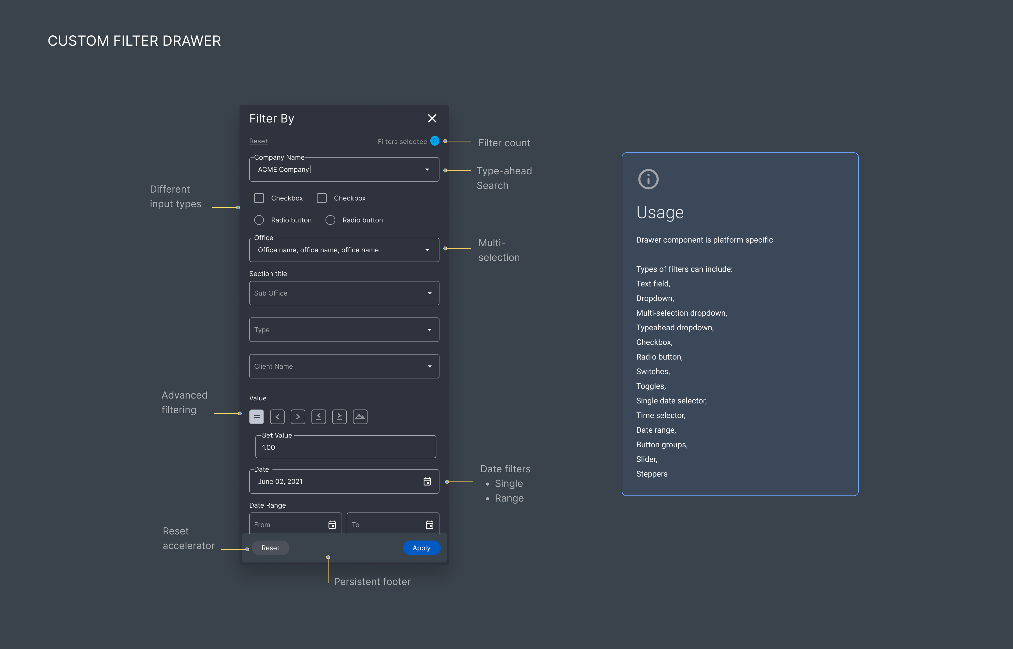
We chose MUI library as a starting point to help increase development velocity on React and reduce the time it takes to bring a product to market. This way we can focus on experiences that make the biggest impact and value like crafting visual and functional data tables.
Component Highlight: Data Tables
In a data-dense industry, over 70% of our platforms are made of data tables. I conducted user interviews to understand how data is used, how users interact with data tables, and what are their JTBDs. I collected over 25 use cases and realized the base MUI data table didn’t provide all the functionality and features we needed.

We decided to customize the data table component with compact layouts and accelerator features like custom filter capabilities, paginations, and robust actions. To add to the complexity, the API returns data in a specific way, so I had to evaluate and account for these limitations and then design accordingly.


Data table component

Filter drawer component

Results
  • Our new data table organizes and presents data in a way that allows user to easily scan, understand and interact with the information. Our accelerator functions enable users to search, sort, and filter easily.
  • Next, we customized a lot of functionality to help users complete tasks more efficiently (per their JTBDs) like providing expandable rows to reduce visual clutter, and display important content that matters most for the task at hand. In addition, enabling users to multi-select rows to perform bulk actions that tie to an external workflow.
The data tables were well received, and provided a more fluid way to scan and compare information in order to derive insights or complete actions, like updating statuses.
Implementation
I worked closely with developers to set up Storybook–a front-end UI development tool to design, build, and organize UI components. From how the components are organized in the library to what controls and interactions are set for each component. Storybook has helped designers like me and stakeholders review and reference UI components without touching code.

Results

Usage Consistency Time Saved

Adoption Rate


This helped speed up development by being able to utilize shared components. Developers can focus on the features rather than wondering if they are using the right buttons or margins. Our collaboration with developers has improved significantly, as I can validate components directly in Storybook and provide real-time feedback.

Storybook example

Learnings & Takeaways
This was my first time creating a full end-to-end design system with a digital brand style guide, design principles, and UI component library, along with responsive and interaction guidelines.

Additional responsive and interaction guidelines

Empowering all to take ownership
After creating the design system, equally as important is advocating for the adoption of the design system. Without people using and adhering to the standards, a design system would be meaningless. I went on to do presentations, lunch & learns, and the team onboarding workshops to help create shared ownership across everyone in the organization. Getting buy-in from the team and organization was crucial to the success of a design system.

Usage Consistency Satisfaction Adoption Rate

I had a developer message me–


"This button doesn’t look like the one in the design system. I will fix it.


I’d call that a win!


VIEW ALL
THE WORKS
NEXT PROJECT →
DriveWealth Brand Website