Web Redesign & Relaunch • Jan - May 2024www.drivewealth.com DriveWealth is a financial services technology platform that powers investing solutions for over 100 global partners serving tens of millions of retail investors.
*All IP belongs to DriveWealth
Project Overview
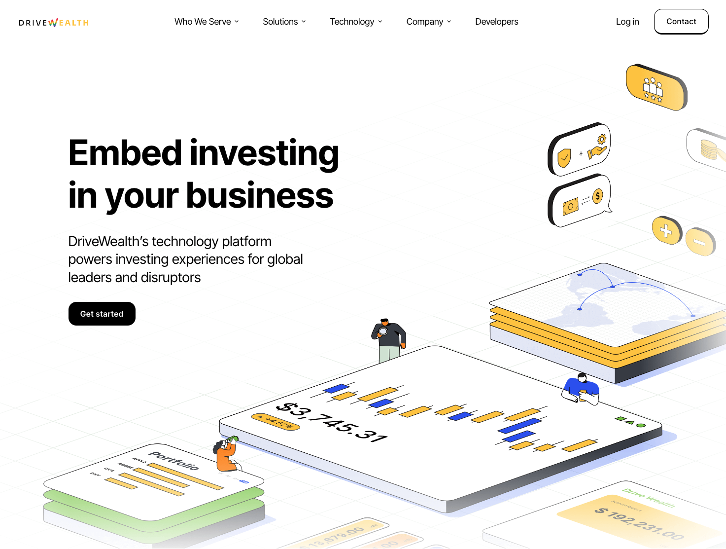
Create a brand identity that establishes DriveWealth as a technology company that makes traditional brokerage feel simple and approachable; not overly complicated. Illustration-driven, modern look and feel with a welcoming tone; highlighting their capabilities and expertise across the website, and the entire customer journey. The goal was to help redesign DriveWealth as a brand and refresh the digital experience to be fully reflective of the brand mission and one that tells the brand narrative. The rebrand not only touched upon a visual refresh, but served as an opportunity to optimize the information architecture that allows for scale and growth.
My Contributions
I was part of a team of 3 talented designers to lead a successful rebrand of DriveWealth's branded website and brand assets. This effort help to enhance the company's market positioning and sales expansion goals. - Brand Strategy - Stakeholder Interviews - Website Concepts - Informational Architecture - UX/UI Design - Branding & Illustration Concepts - Brand Asset Developement
The Research
Brand Design, User Experience
Stakeholder Interviews
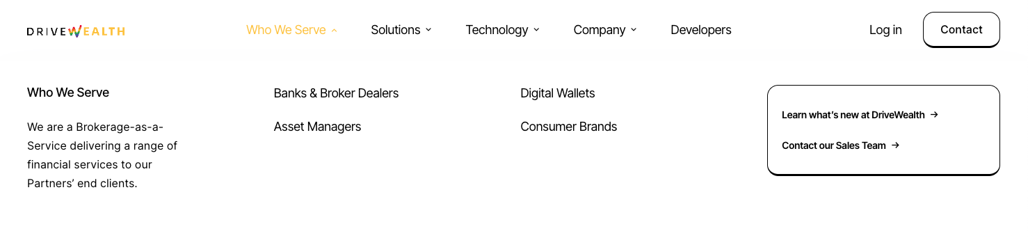
We conducted stakeholder interviews to solidify the value proposition and market differentiation. Our goal was to understand the competitive landscape and challenges. In order to better serve their target audience, we had to improve the informational architecture. The newly re-engineered sitemap better reflects the company's mission and vision, and serves as jumping points to navigate the website more efficiently.
Design Principles
Brand Design, User Experience
I focused the brand redesign with a few design principles
- Modern look and feel: Resemble a fintech and SaaS company, not traditional financial services
- Keep it simple and intentional: Use simple language and less brokerage speak
- Illustration-driven: Great interactive experiences whenever possible
- Responsive Design with lots of white space
My brand concept involved a lot of intentional illustrations to help illustrate and simplify the complexities of the brokerage world. We distilled the brokerage's capabilities into digestible content, paired with illustrations and parallax scrolling to add movement.
After solidifying the design direction and a re-engineered sitemap, we worked with a content writer on hierarchy and copy. The responsive prototype I created in figma helped to gain alignment and feedback from various stakeholders.
The website launched in May 2024, and better reflects the company's mission and values.